ads
letterhead collection
by Steven Heller


famous LOGOS
hidden DESIGN
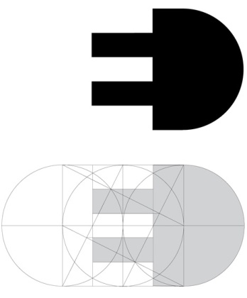
Widely recognized as one of the best ever designed, FedEx‘s logo is highly effective for a number of reasons, not just because of its hidden arrow, according to typography expert Paul McNeil: “The key functions of any logo are to identify, to attract and to inform in the most compact, immediate and memorable ways possible. The Fedex logo achieves this through a number of visual tactics, not least of which is the amendment of the name itself from the lugubrious, archaic and official-sounding Federal Express to the much more concise, simple, vernacular form of Fedex,” he said in an email interview.
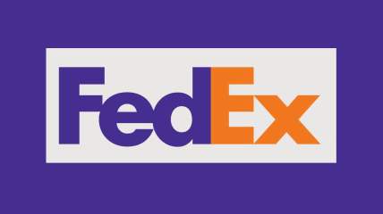
Before it was absorbed by Delta in 2008, Northwest Airlines used a logo designed by Landor Associates, the same studio that made the FedEx logo. The circle and the arrow create a compass pointing to the northwest; but the arrow, together with the “N,” also creates a “W” that has part of its left leg removed.
![]()
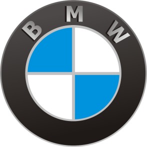
The logo of German car maker BMW was long thought to represent a stylized aircraft propeller against a blue sky background, in a reference to BMW’s historic past as a manufacturer of airplane engines. More recently, however, the company has clarifiedthat the roundel actually represents the flag of Bavaria, the German federal state where the company originated. The association with planes was apparently born out of a single 1929 ad that featured the logo next to an actual propeller plane.
The current Amazon logo was introduced in 2000, replacing an older version that had a yellow downward curve underlining “amazon.com.” The curve was flipped to resemble a smile, but also turned into an arrow that starts with the letter “A” and ends with a dimple under the “Z.” A press release from the time clarifies that this is meant to emphasize that Amazon offers everything, from A to Z.
![]()
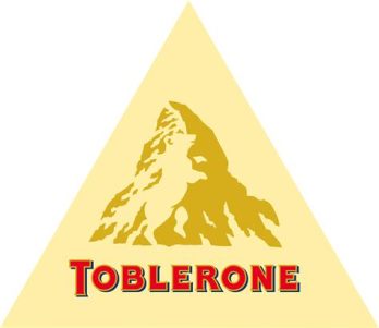
The Toblerone chocolate bar originates from the Swiss city of Bern, which sits not far from the famous Matterhorn mountain that is depicted in its logo. But if you look closely inside the mountain, you’ll see the actual symbol of Bern: a bear.
The logo for the Tour de France includes a cyclist. Can you see it? The body is the letter “R,” while the “O” and the yellow sun make up the wheels.
![]()
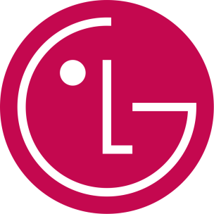
The round part of the logo of South Korean electronics manufacturer LG is made up of the letters “L” and “G,” but also resembles a winking human face. Interestingly, rotating it slightly to the right and interlocking the “L” and the “G” turns it into Pac-Man.
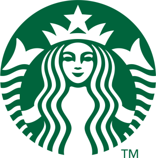
The most recent version of Starbucks‘ logo, introduced in 2011, is slightly asymmetrical. If you look closely, the nose outline on the right side goes deeper down than the left side. Although this is against the accepted wisdom that symmetry is beauty, it is intentional, as the designers felt that a slightly asymmetrical look would make the mermaid appear more human.
The logo for defunct Italian appliances company Elettro Domestici (“electrical appliances” in Italian), designed by Gianni Bortolotti, is a great example of negative space use, as the letters “E” and D” naturally form the shape of an electrical plug.
The SONY Vaio line of computers has an interesting logo that is meant to represent both the analog and digital aspects of a computer. The letters “VA” form an analog wave, while the letters “IO” represent the “1” and “0 “of binary code.
![]()
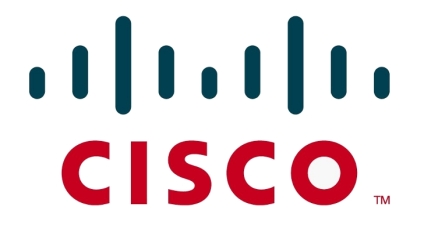
Although its headquarters is in nearby San Jose, the logo of networking hardware company Cisco Systems is a homage to San Francisco, both in the name itself and in the design, which represents the Golden Gate Bridge.
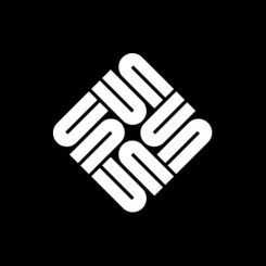
Hardware computer company Sun Microsystems was founded in 1982 by Stanford graduate students. (“Sun” was an acronym for Stanford University Network.) The logo, which is technically a rotationally symmetric ambigram, was designed by Stanford professor emeritus Vaughan Pratt, and features four interleaved copies of the word “Sun,” with the two coupled symbols readable as both the letter “S” and the letters “UN.” Sun Microsystems no longer exists as a standalone company, as it was acquired by Oracle in 2010.
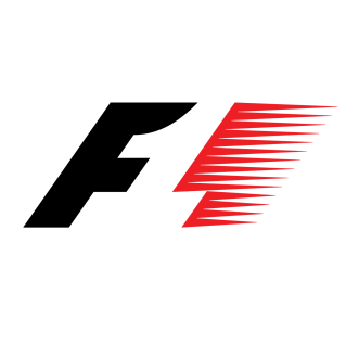
Before switching to a new logo in 2017, Formula 1 racing held onto this one for 23 years. The letter “F” and the red speed marks on the right beautifully create the number “1” in the middle through negative space. Apparently this wasn’t evident to most viewers, prompting the redesign.
French supermarket chain Carrefour‘s logo is made of two diverging arrows (“carrefour” means crossroads in French) that also create a stylish “C” in the middle.
![]()
A good example of negative space use comes from tire manufacturer Continental: the “C” and the “O” look strangely close, until you realize they create the shape of a tire.
![]()
In what is apparently a trope of Washington sports teams, the NHL’s Washington Capitals have hidden the Capitol building in their logo, right under the eagle’s head.
![]()
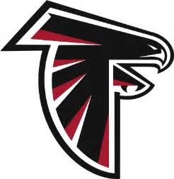
The NFL’s Atlanta Falcons have a stylized falcon as their logo, although you may have looked at it for years without noticing that it also doubles as the team’s initial letter “F.”
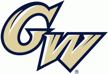
The logo of the George Washington Colonials NCAA team has a very cleverly hidden design in it: a stylized Washington Monument, in the middle of the “W.”
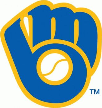
The classic Milwaukee Brewers logo, used from 1978 to 1993, was a delightful design: the team’s initials are combined to create a baseball glove.
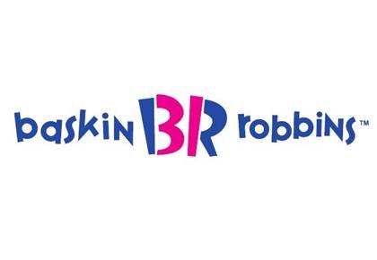
Ice cream chain Baskin-Robbins is known for having 31 original flavors (“One for every day of the month“), and they have long used the number 31 in their logo. The latest version cleverly hides the numbers in the letters “B” and “R.”
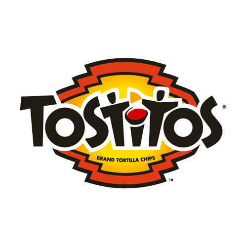
The two “Ts” in the logo for Tostitos double as two people holding tortillas, ready to be dipped into the pot of salsa represented by the dot on the letter “I.”
this articles originally appeared on CNN and has be re-edited for a better understanding of the graphic logos.
Zazzle for Visuality
horror movie posters

The Bride of Frankenstein, 1935. COURTESY OF THE KIRK HAMMETT HORROR AND SCI-FI MEMORABILIA COLLECTION AND UNIVERSAL STUDIOS LICENSING, LLC.

The Mummy, attributed to Karoly Grosz, 1932. COURTESY OF THE KIRK HAMMETT HORROR AND SCI-FI MEMORABILIA COLLECTION AND UNIVERSAL PICTURES LICENSING, LLC.


Fortunato Depero
Depero
Libro macchina imbullonato
Anacapri riesumazioni alpine
Diavolo Baffuto per l’inferno del Cabaret del Diavolo
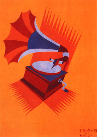
Grammofono
Il Bevitore
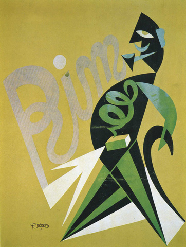
Rim digestivo
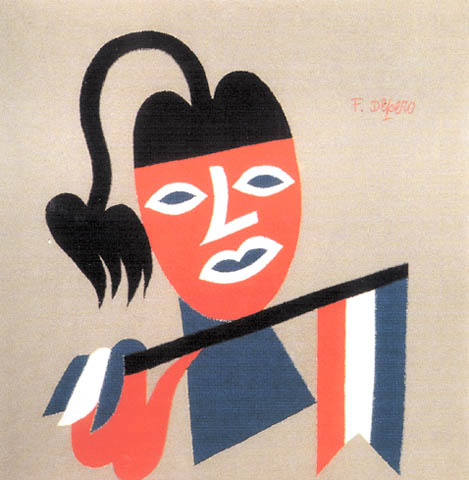
Balilla
Campari squisito al Seltz
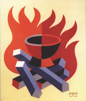
Fago cioccolato fondente
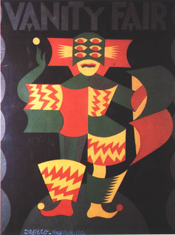
Vanity Fair, progetto per copertina
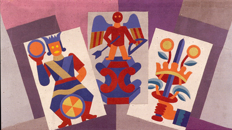
Carte da gioco
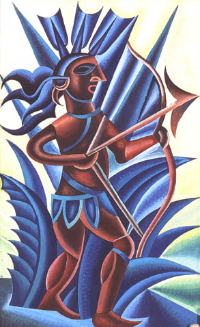
Freccia Indiana
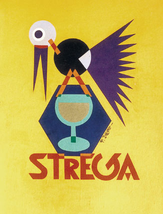
Liquore Strega
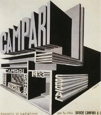
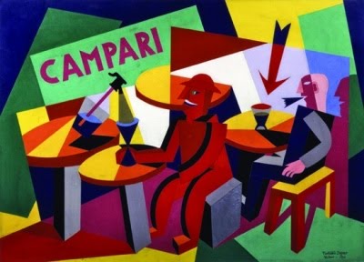
Padiglione Campari
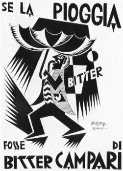
Bitter Campari
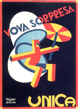
Ovetti Venchi Unica
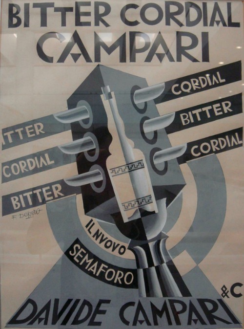
Bitter Cordial Campari
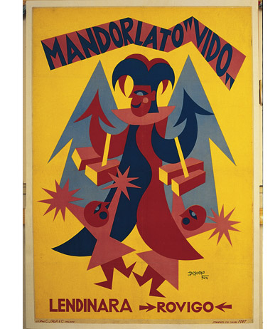
Mandorlato Vido
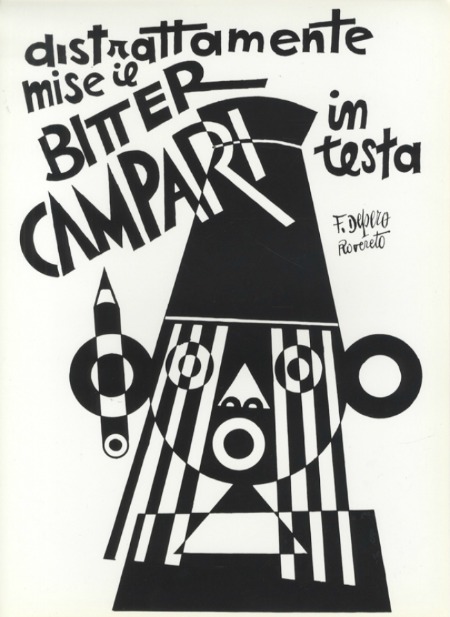
Bitter Campari
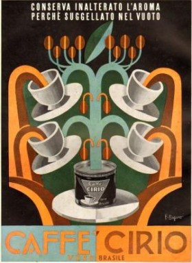
caffè Cirio
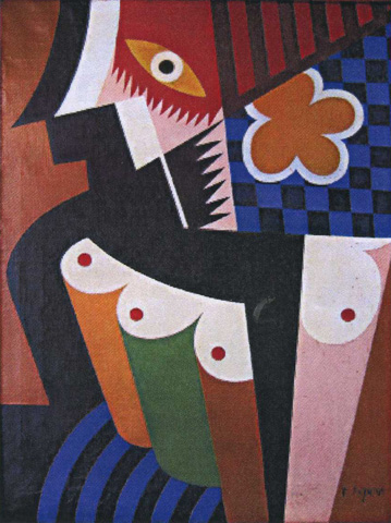
Costruzione di donna con fiore giallo
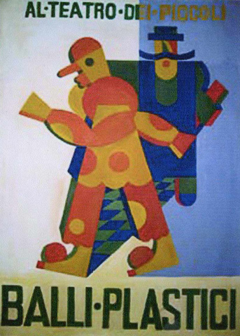
Al teatro dei piccoli
Tarocchi

Incomplete Tarot: An Unfinished Set of Cards: Volume 5 (Visuality Books)
by Simone Gallina
Link: http://amzn.in/3LEuMQW
by Simone Gallina
Link: http://amzn.in/3LEuMQW
Bombay A Day

Mumbai a Day: Daily Clicks: Volume 6 (Visuality Books)
by Simone Gallina
Link: http://amzn.in/7aPHxIk
by Simone Gallina
Link: http://amzn.in/7aPHxIk
UOVA

Eggs: Freehand Drawings of Eggs, Everywhere, Anywhere, Anyway.: Volume 2 (Visuality Books)
by Simone Gallina
Link: http://amzn.in/3j5DwXN
by Simone Gallina
Link: http://amzn.in/3j5DwXN
GATTI

Cats: Freehand Drawings of Felines, Everywhere, Anywhere, Anyway: Volume 1 (Visuality Books)
by Simone Gallina
Link: http://amzn.in/dzzlPte
by Simone Gallina
Link: http://amzn.in/dzzlPte
