art

Soviet Space illustrations
from the book Soviet Space Graphics: Cosmic Visions from the USSR.
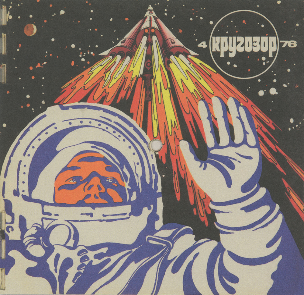


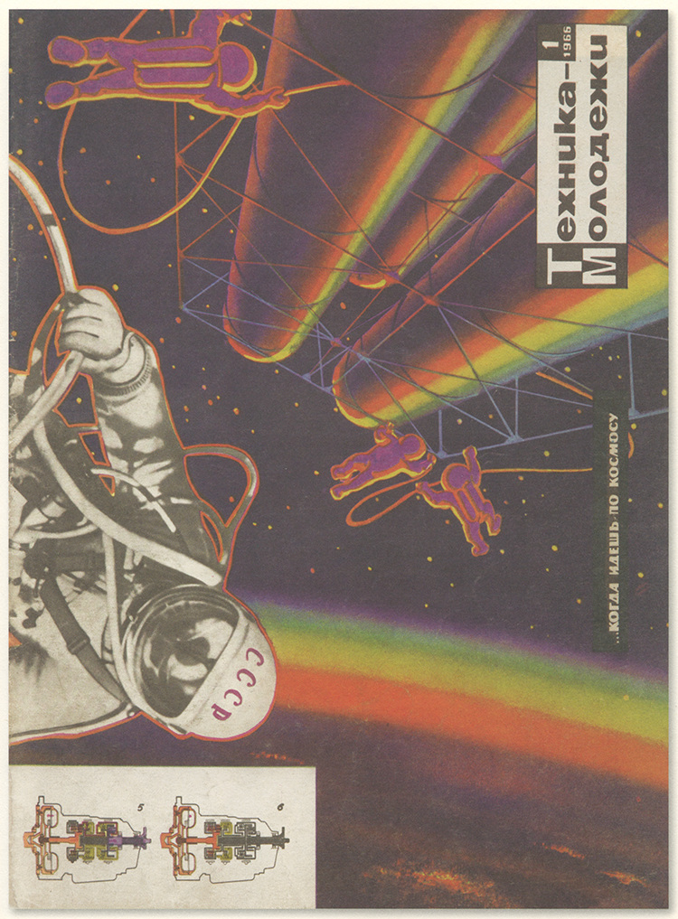

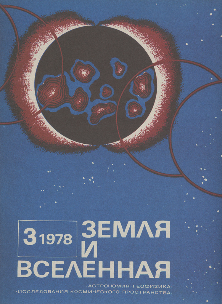

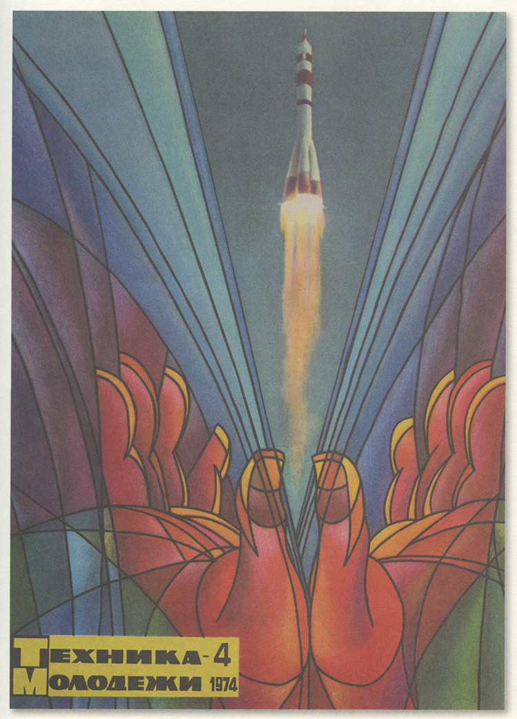

(previously published on 50 Watts Books.)
1900
Dutch Art Nouveau & Art Deco book design (and ephemera) from the collection of Sipke van de Peppel and his sites anno1900.nl and DutchBookDesign.com. Sipke also puts together annual planners full of this striking but forgotten imagery.

Bookbinding for Een boek van verbeelding by Louise Ahn-de Jongh, design: Jan Toorop (1893).
Collection of anno1900.nl / Sipke van de Peppel.

Cover for Psyche by Louis Couperus, design: Jan Toorop (1898). Collection of anno1900.nl.

cover design: Wim Wijnman (1918). Collection of anno1900.nl.

cover design: Wim Wijnman (1929). Collection of anno1900.nl.

design: Pieter Hofman (1927). Collection of anno1900.nl.

design: Joan Collette (1920). Collection of anno1900.nl.

Program by Elias Ott for Theater Tuschinski (1923). Collection of anno1900.nl.

design: Wilhelmina Drupsteen (1907). Collection of anno1900.nl.

design: Joan Colette (1922). Collection of anno1900.nl.

“Benjamin S. Claus decorated the diploma of the ‘Ambachtsschool in (Den) Helder’. Claus gave drawing lessons at the crafts school in Arnhem. His style is influenced by the ‘foreign’ Art Nouveau; the lines are more flowing and the natural motifs are less stylized.” Collection of anno1900.nl.

design: Emilie van Kerckhoff (1897). Collection of anno1900.nl.

design: Chris Lebeau (1914). Collection of anno1900.nl.

cover design Lambertus Zwiers, 1918. Collection of anno1900.nl.

binding by M. de Lange (1935). Collection of anno1900.nl.
Serious book envy for this Henricus book:

Illustration by Henricus (Hendricus Jansen, 1867-1921) for Dat Liedekin van Heere Halewine (1904).
Collection of anno1900.nl.

Illustration by Henricus (Hendricus Jansen, 1867-1921) for Dat Liedekin van Heere Halewine (1904).
Collection of anno1900.nl.

Illustration by Henricus (Hendricus Jansen, 1867-1921) for Dat Liedekin van Heere Halewine (1904).
Collection of anno1900.nl.
This post first appeared on October 28, 2020 on 50 Watts
i Tarocchi AFRO
DrawQuest: il libro
da oggi disponibile su Amazon
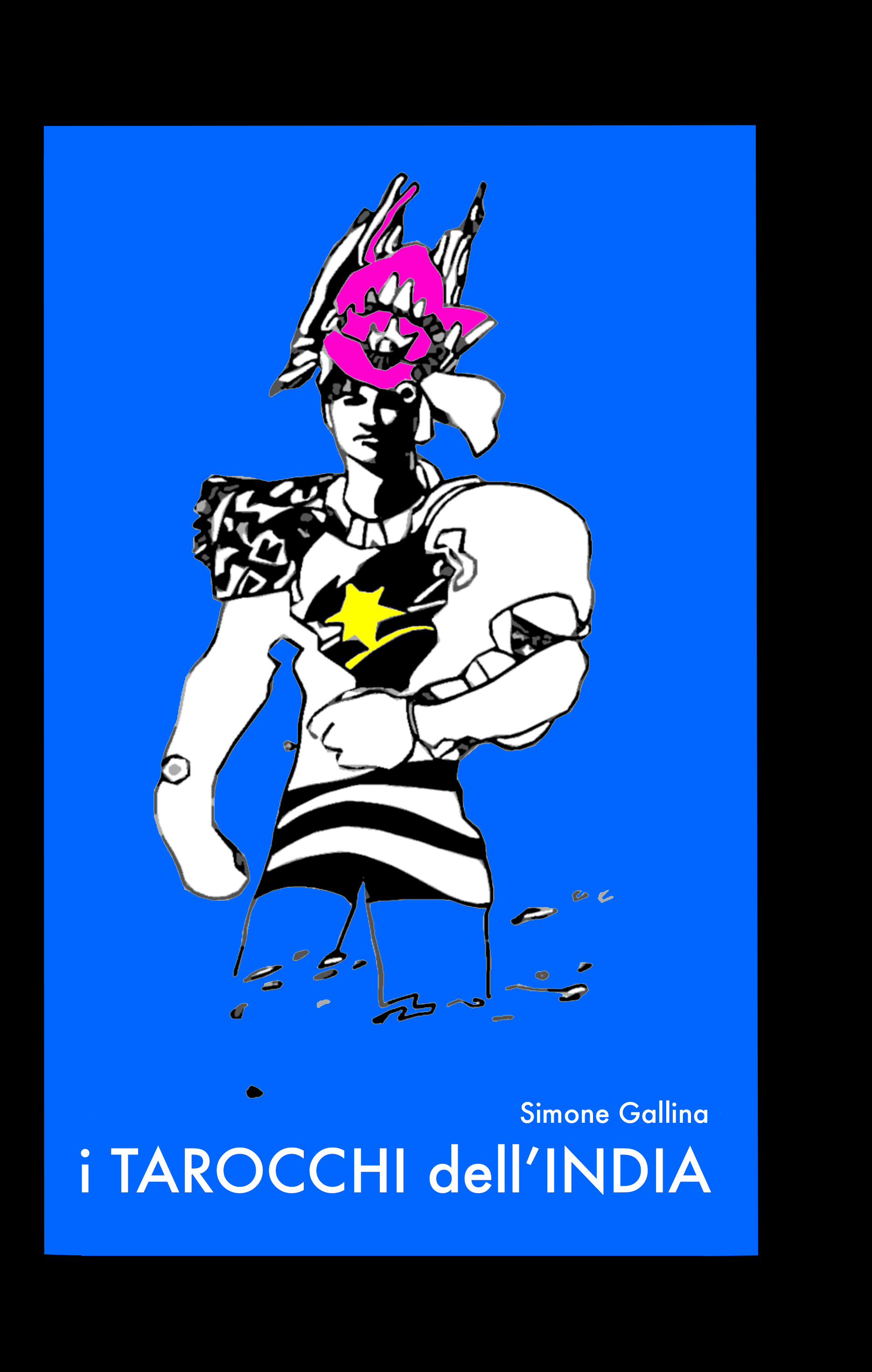
i Tarocchi dell’India
nuovo volume tutto da colorare disponibile su IL MIO LIBRO.IT
letterhead collection
by Steven Heller


Brian Reedy’s linocuts


famous LOGOS
hidden DESIGN
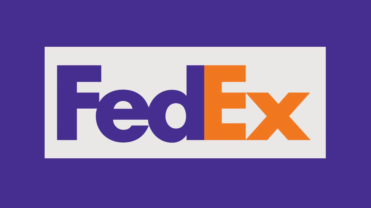
Widely recognized as one of the best ever designed, FedEx‘s logo is highly effective for a number of reasons, not just because of its hidden arrow, according to typography expert Paul McNeil: “The key functions of any logo are to identify, to attract and to inform in the most compact, immediate and memorable ways possible. The Fedex logo achieves this through a number of visual tactics, not least of which is the amendment of the name itself from the lugubrious, archaic and official-sounding Federal Express to the much more concise, simple, vernacular form of Fedex,” he said in an email interview.
Before it was absorbed by Delta in 2008, Northwest Airlines used a logo designed by Landor Associates, the same studio that made the FedEx logo. The circle and the arrow create a compass pointing to the northwest; but the arrow, together with the “N,” also creates a “W” that has part of its left leg removed.
![]()
The logo of German car maker BMW was long thought to represent a stylized aircraft propeller against a blue sky background, in a reference to BMW’s historic past as a manufacturer of airplane engines. More recently, however, the company has clarifiedthat the roundel actually represents the flag of Bavaria, the German federal state where the company originated. The association with planes was apparently born out of a single 1929 ad that featured the logo next to an actual propeller plane.

The current Amazon logo was introduced in 2000, replacing an older version that had a yellow downward curve underlining “amazon.com.” The curve was flipped to resemble a smile, but also turned into an arrow that starts with the letter “A” and ends with a dimple under the “Z.” A press release from the time clarifies that this is meant to emphasize that Amazon offers everything, from A to Z.
![]()
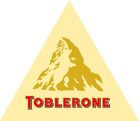
The Toblerone chocolate bar originates from the Swiss city of Bern, which sits not far from the famous Matterhorn mountain that is depicted in its logo. But if you look closely inside the mountain, you’ll see the actual symbol of Bern: a bear.
The logo for the Tour de France includes a cyclist. Can you see it? The body is the letter “R,” while the “O” and the yellow sun make up the wheels.
![]()
The round part of the logo of South Korean electronics manufacturer LG is made up of the letters “L” and “G,” but also resembles a winking human face. Interestingly, rotating it slightly to the right and interlocking the “L” and the “G” turns it into Pac-Man.

The most recent version of Starbucks‘ logo, introduced in 2011, is slightly asymmetrical. If you look closely, the nose outline on the right side goes deeper down than the left side. Although this is against the accepted wisdom that symmetry is beauty, it is intentional, as the designers felt that a slightly asymmetrical look would make the mermaid appear more human.

The logo for defunct Italian appliances company Elettro Domestici (“electrical appliances” in Italian), designed by Gianni Bortolotti, is a great example of negative space use, as the letters “E” and D” naturally form the shape of an electrical plug.
The SONY Vaio line of computers has an interesting logo that is meant to represent both the analog and digital aspects of a computer. The letters “VA” form an analog wave, while the letters “IO” represent the “1” and “0 “of binary code.
![]()
Although its headquarters is in nearby San Jose, the logo of networking hardware company Cisco Systems is a homage to San Francisco, both in the name itself and in the design, which represents the Golden Gate Bridge.

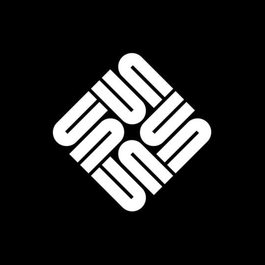
Hardware computer company Sun Microsystems was founded in 1982 by Stanford graduate students. (“Sun” was an acronym for Stanford University Network.) The logo, which is technically a rotationally symmetric ambigram, was designed by Stanford professor emeritus Vaughan Pratt, and features four interleaved copies of the word “Sun,” with the two coupled symbols readable as both the letter “S” and the letters “UN.” Sun Microsystems no longer exists as a standalone company, as it was acquired by Oracle in 2010.
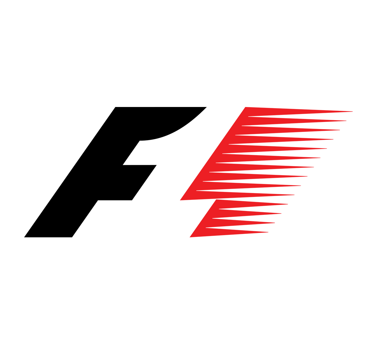
Before switching to a new logo in 2017, Formula 1 racing held onto this one for 23 years. The letter “F” and the red speed marks on the right beautifully create the number “1” in the middle through negative space. Apparently this wasn’t evident to most viewers, prompting the redesign.
French supermarket chain Carrefour‘s logo is made of two diverging arrows (“carrefour” means crossroads in French) that also create a stylish “C” in the middle.
![]()
A good example of negative space use comes from tire manufacturer Continental: the “C” and the “O” look strangely close, until you realize they create the shape of a tire.
![]()
In what is apparently a trope of Washington sports teams, the NHL’s Washington Capitals have hidden the Capitol building in their logo, right under the eagle’s head.
![]()
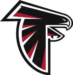
The NFL’s Atlanta Falcons have a stylized falcon as their logo, although you may have looked at it for years without noticing that it also doubles as the team’s initial letter “F.”
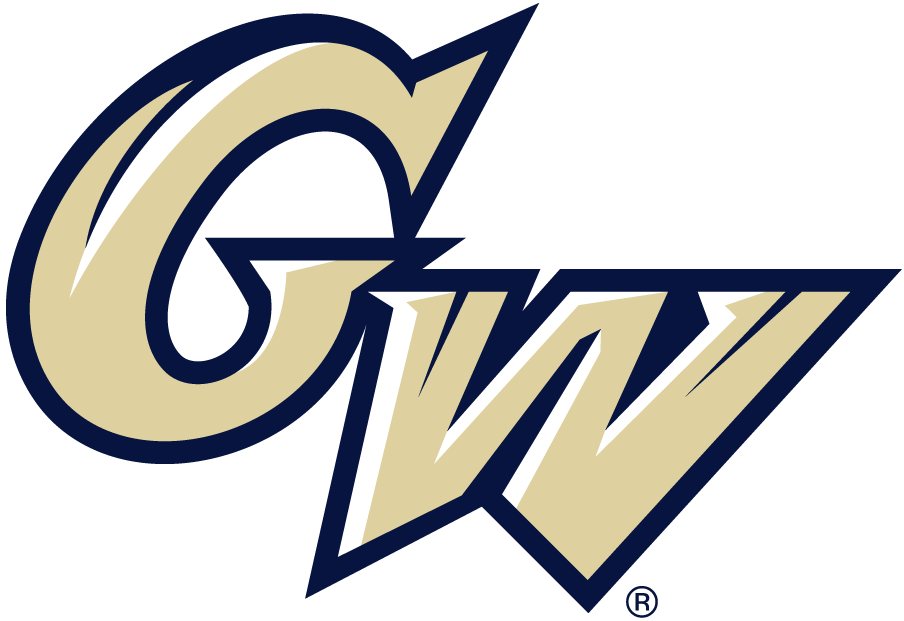
The logo of the George Washington Colonials NCAA team has a very cleverly hidden design in it: a stylized Washington Monument, in the middle of the “W.”
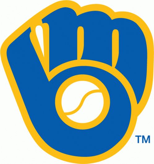
The classic Milwaukee Brewers logo, used from 1978 to 1993, was a delightful design: the team’s initials are combined to create a baseball glove.
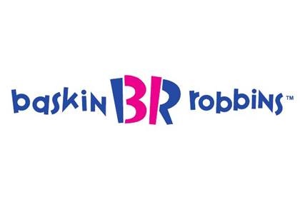
Ice cream chain Baskin-Robbins is known for having 31 original flavors (“One for every day of the month“), and they have long used the number 31 in their logo. The latest version cleverly hides the numbers in the letters “B” and “R.”
The two “Ts” in the logo for Tostitos double as two people holding tortillas, ready to be dipped into the pot of salsa represented by the dot on the letter “I.”

this articles originally appeared on CNN and has be re-edited for a better understanding of the graphic logos.
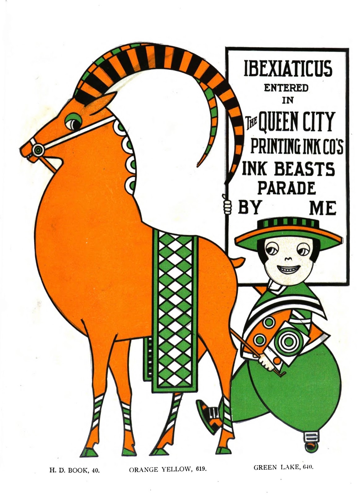
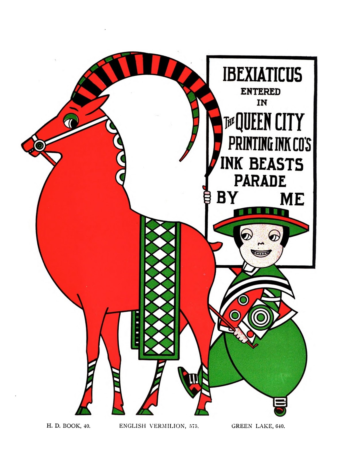
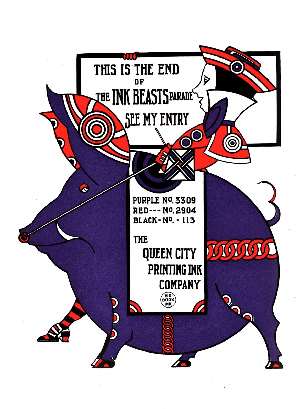
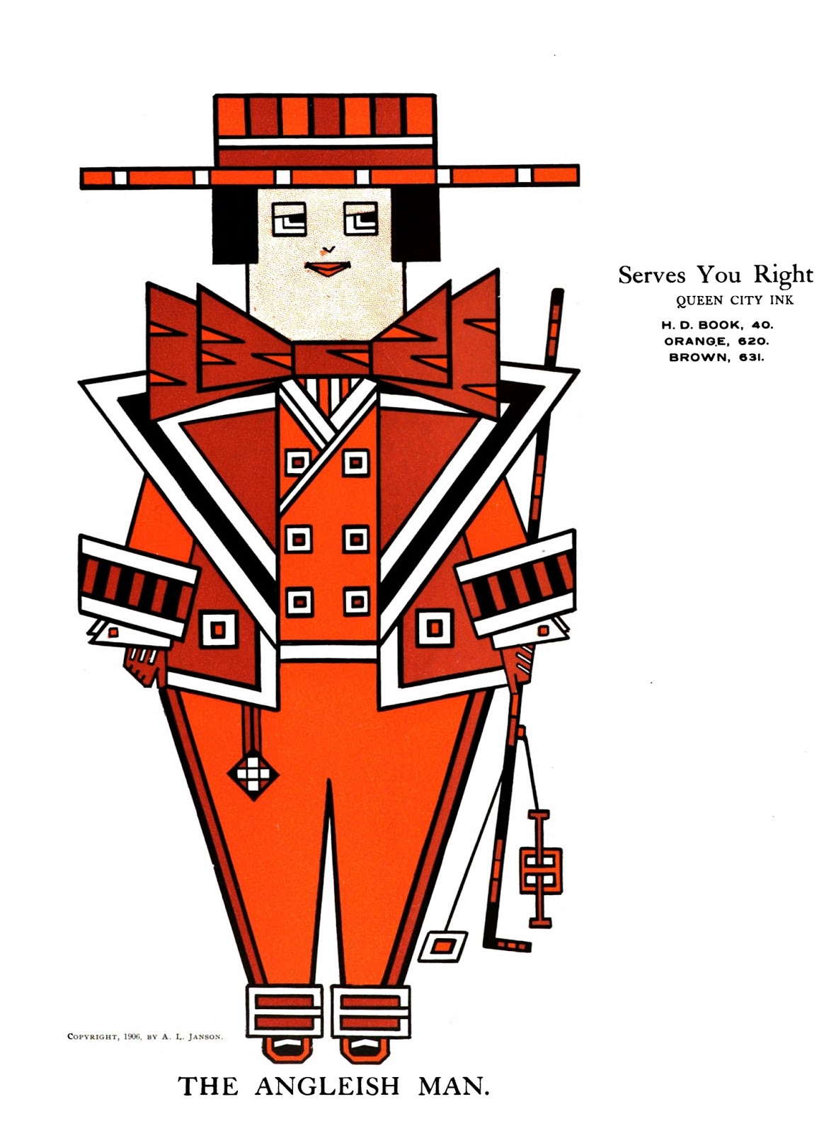
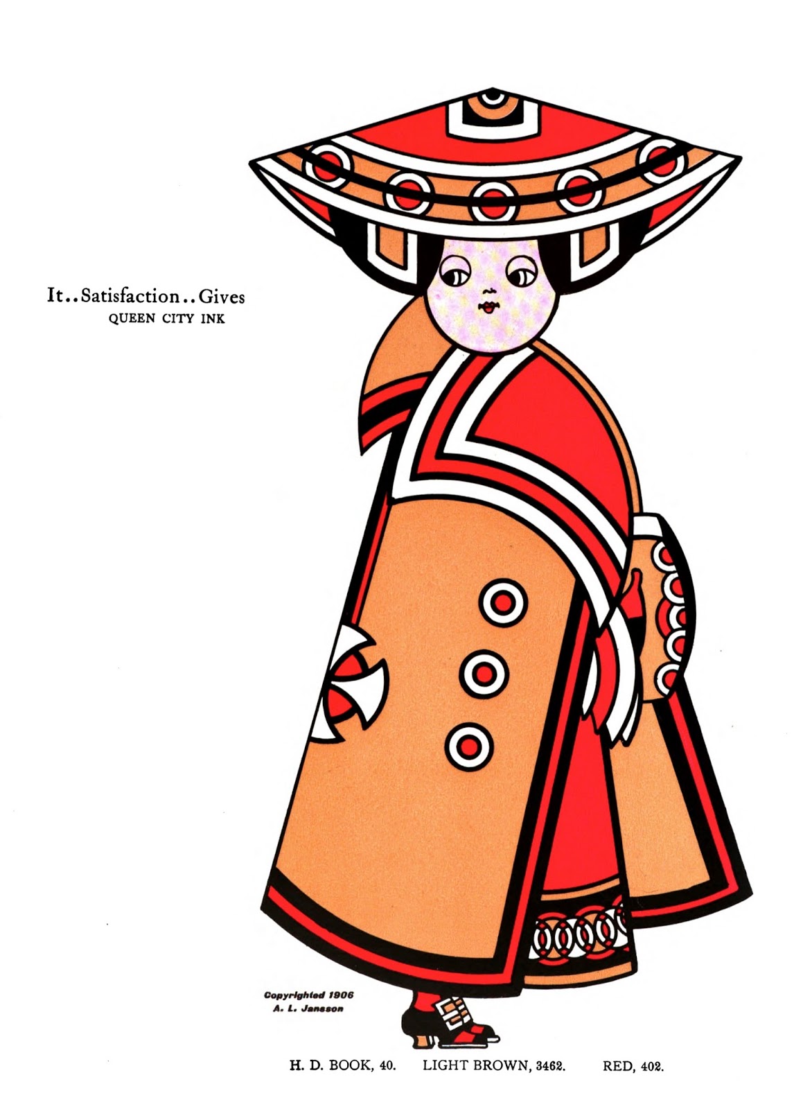
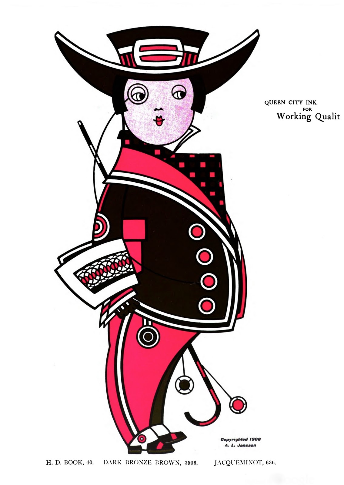
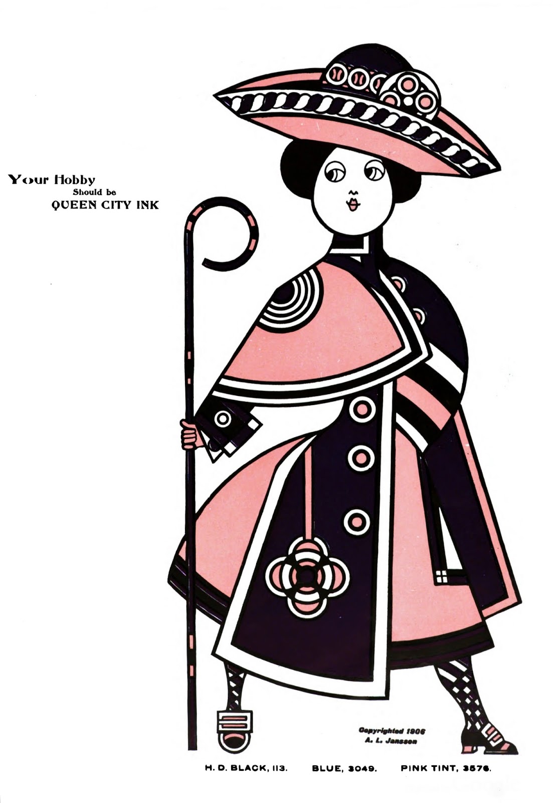
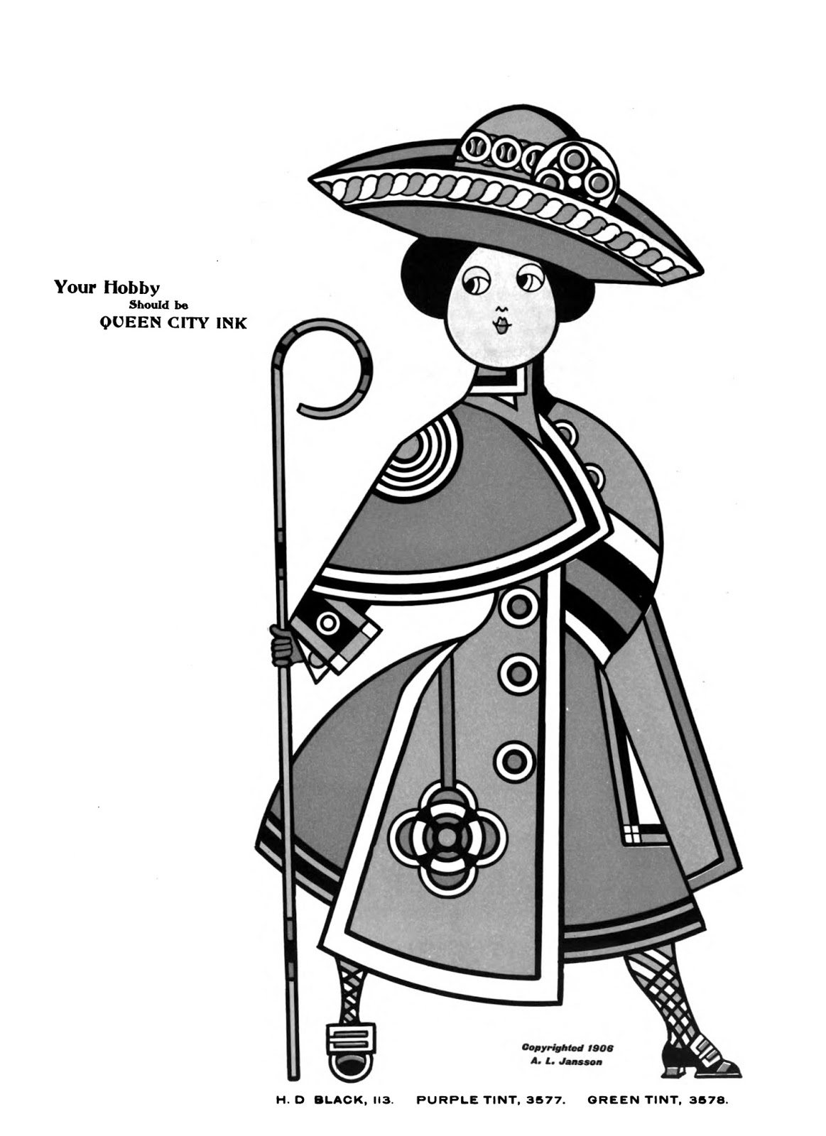
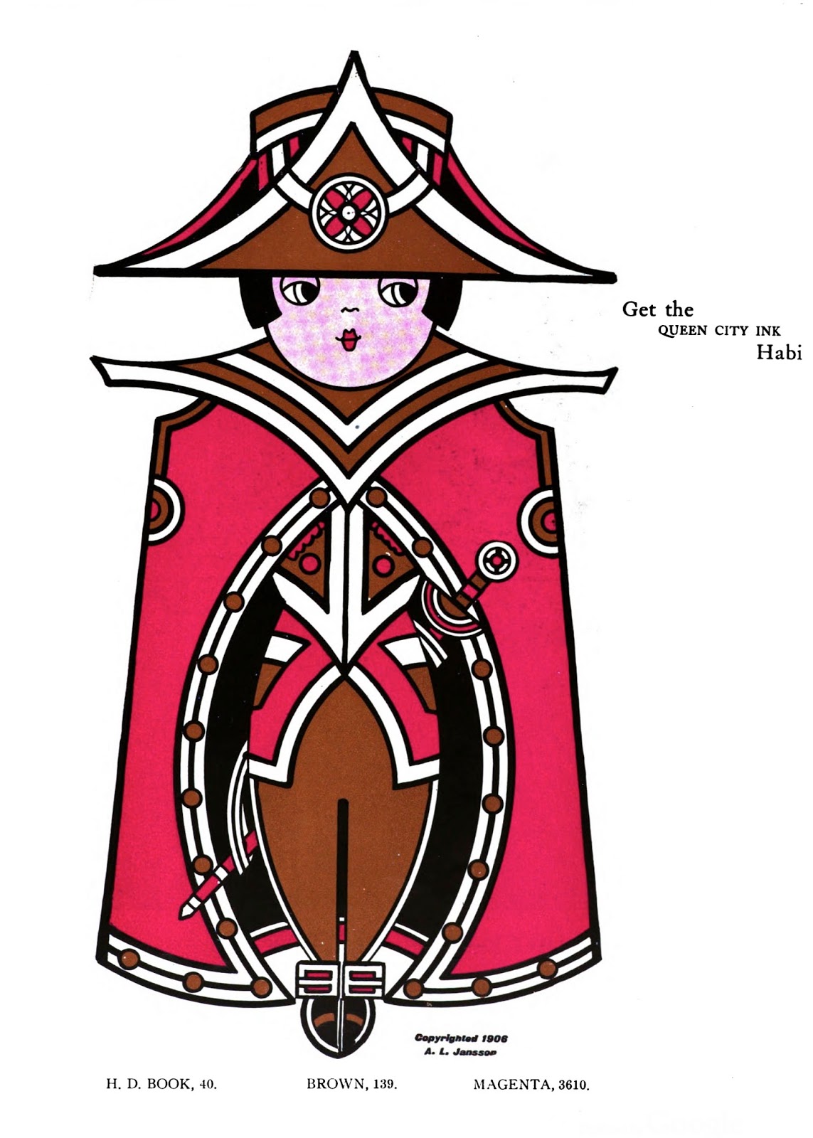
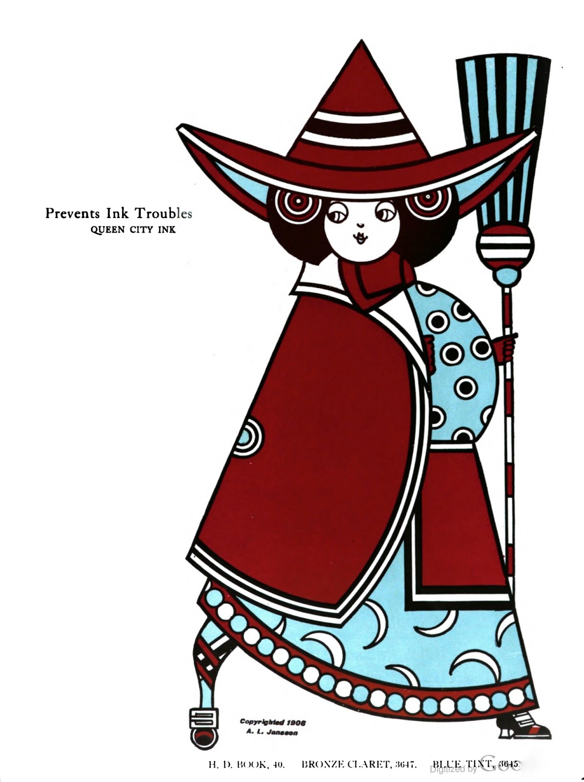
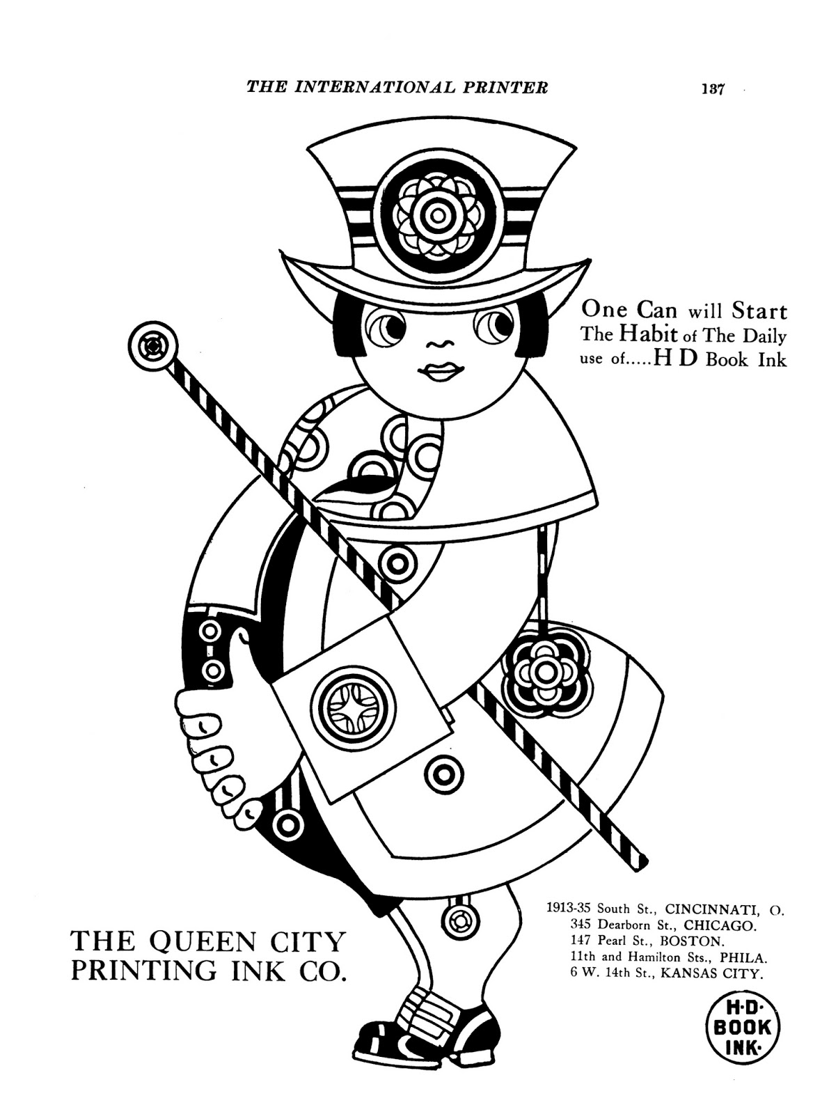
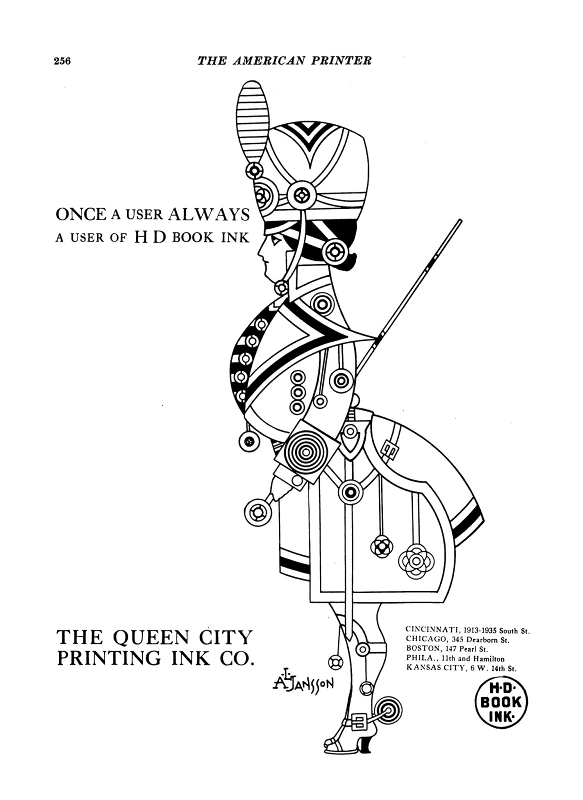
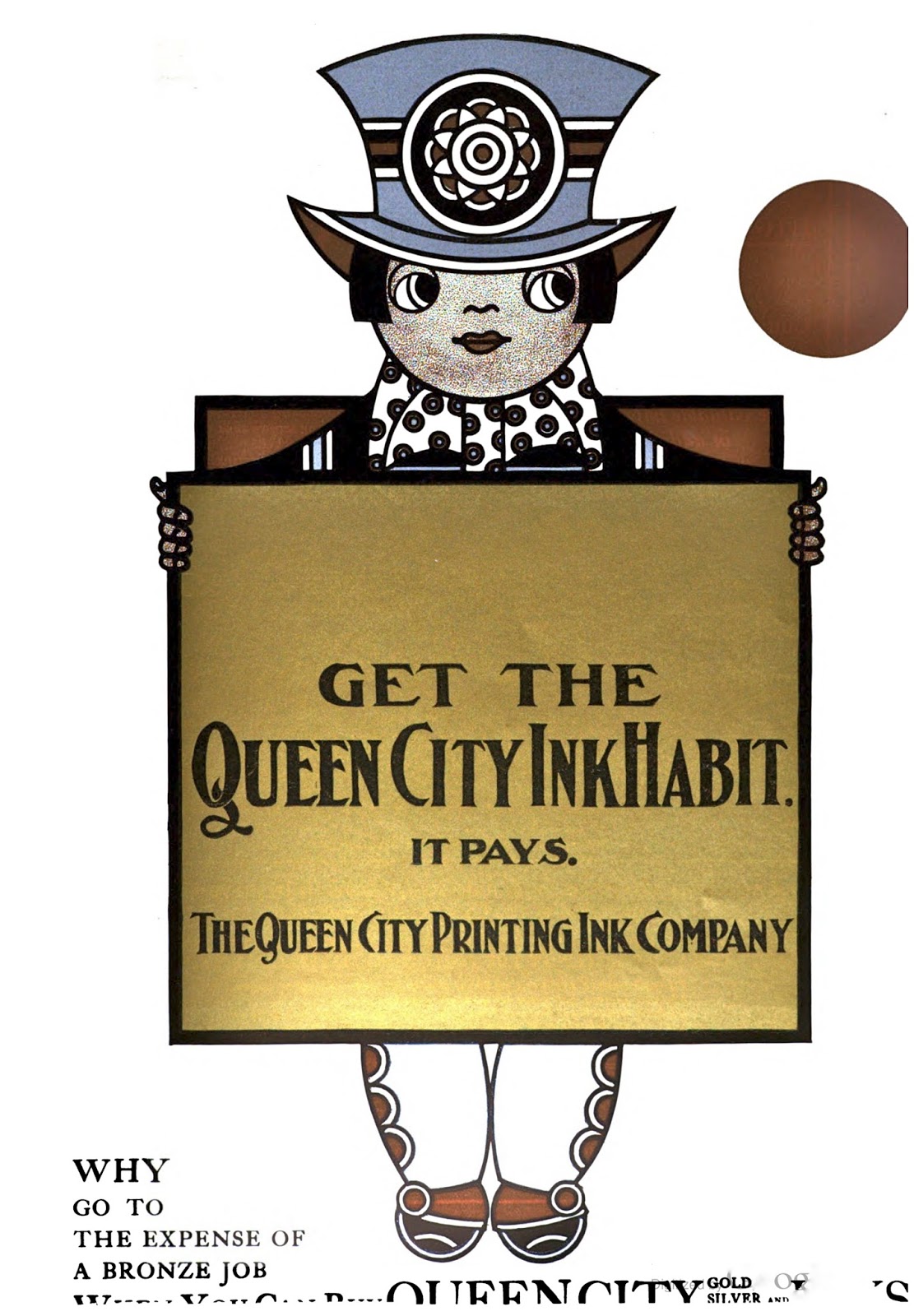
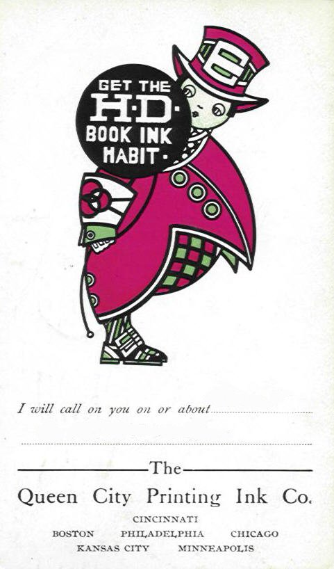
Augustus L. Jansson
born April 17, 1866, commercial artist and a cartoonist Jansson’s work appeared in comic strips, in book illustrations, advertising, and on postcards.
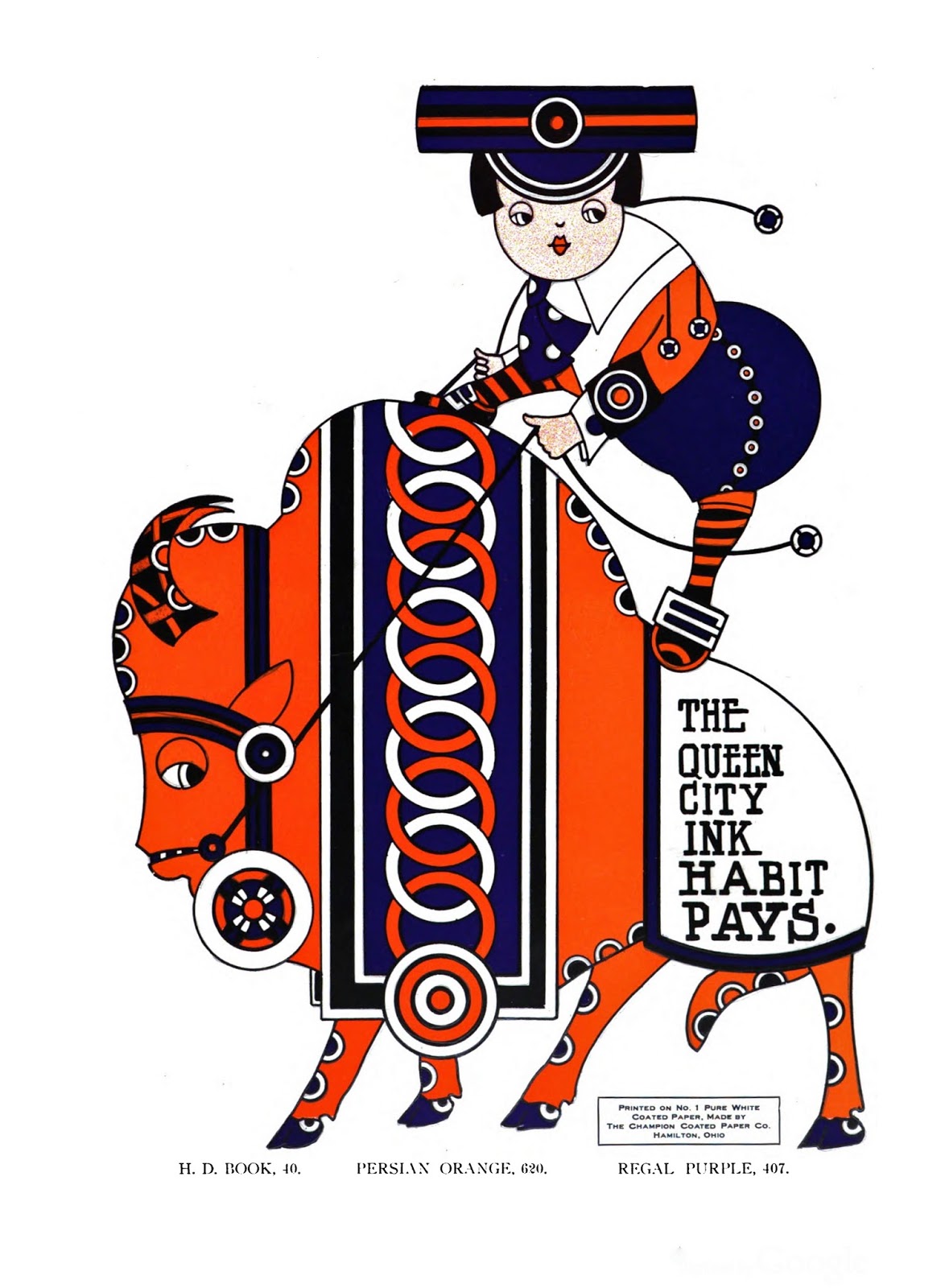
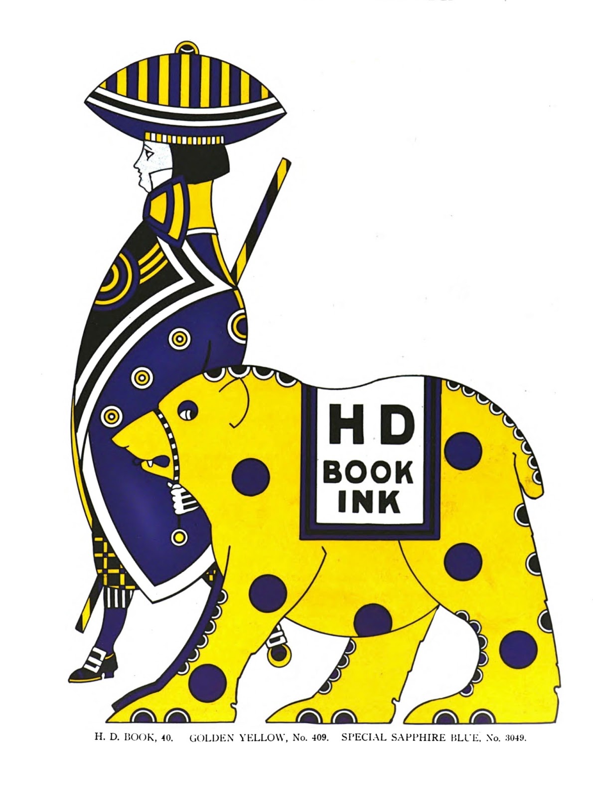
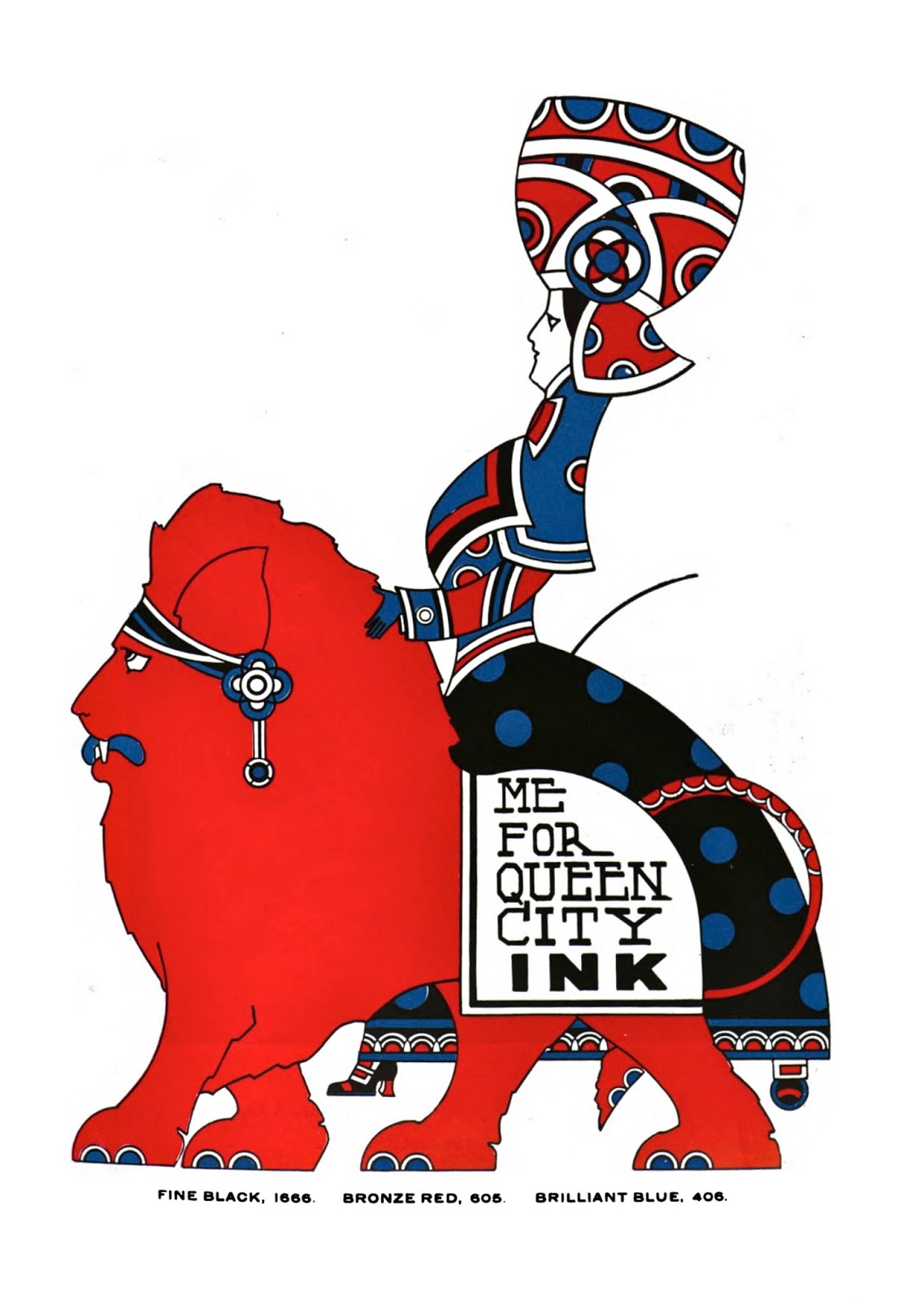
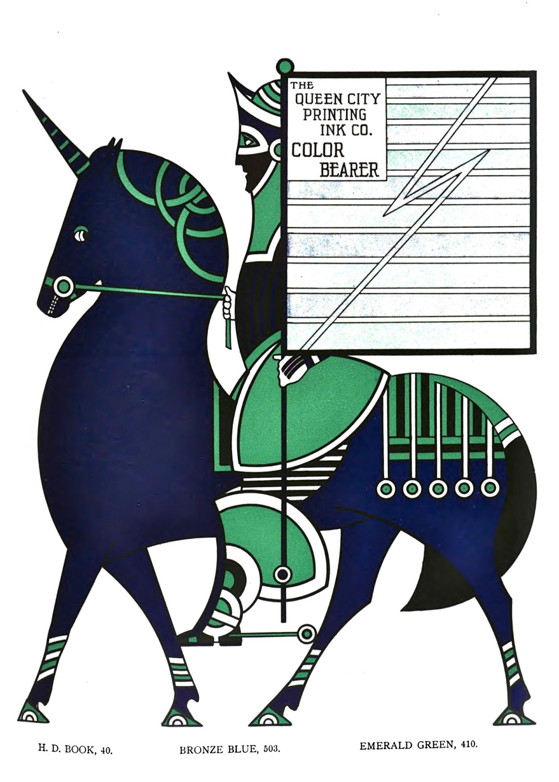
Queen City Printing Ink Company Advertisements
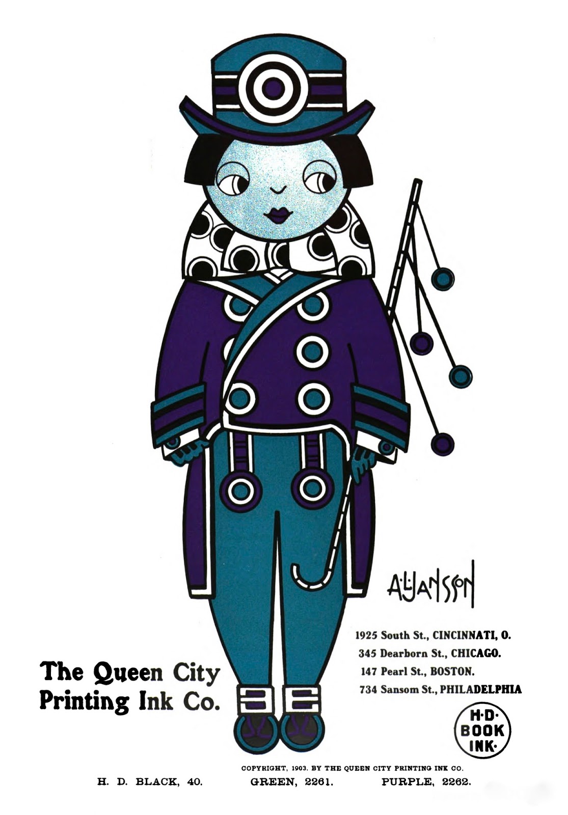
The Inland Printer, September 1903

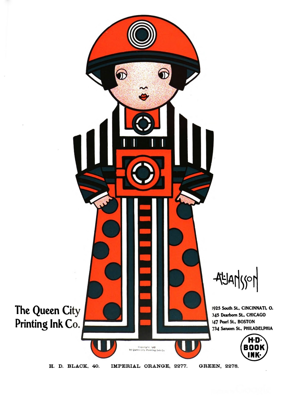
The Inland Printer, October 1903 (postcard version is here)

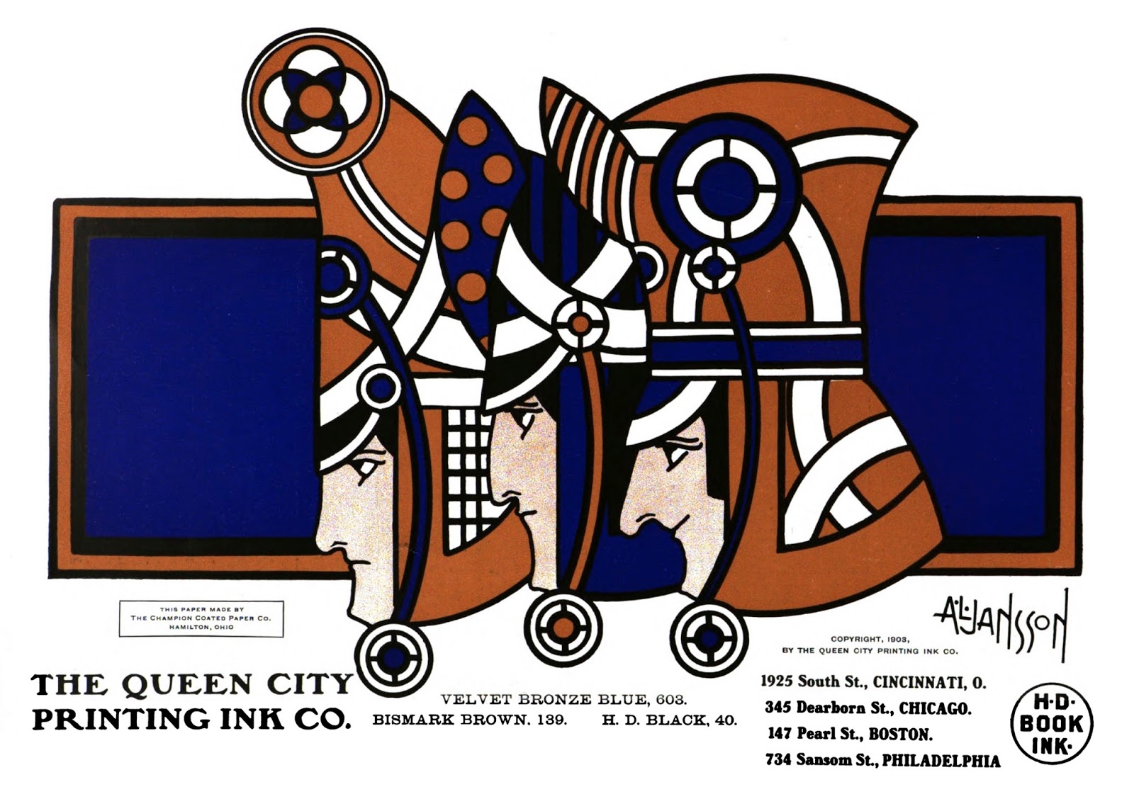
The Inland Printer, November 1903
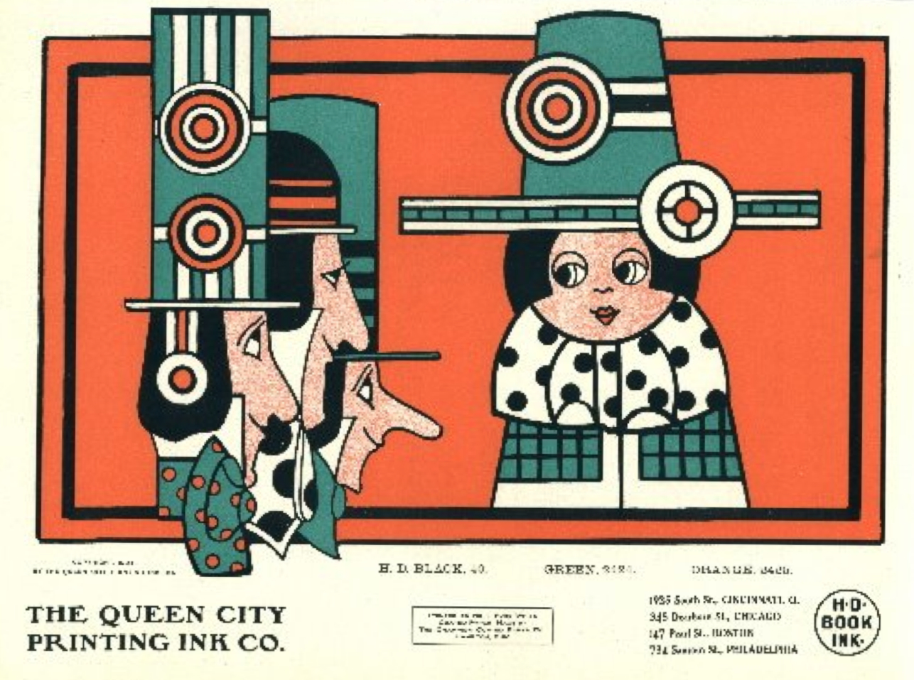
The Inland Printer, December 1903
The Inland Printer, January 1904
The Inland Printer, February 1904

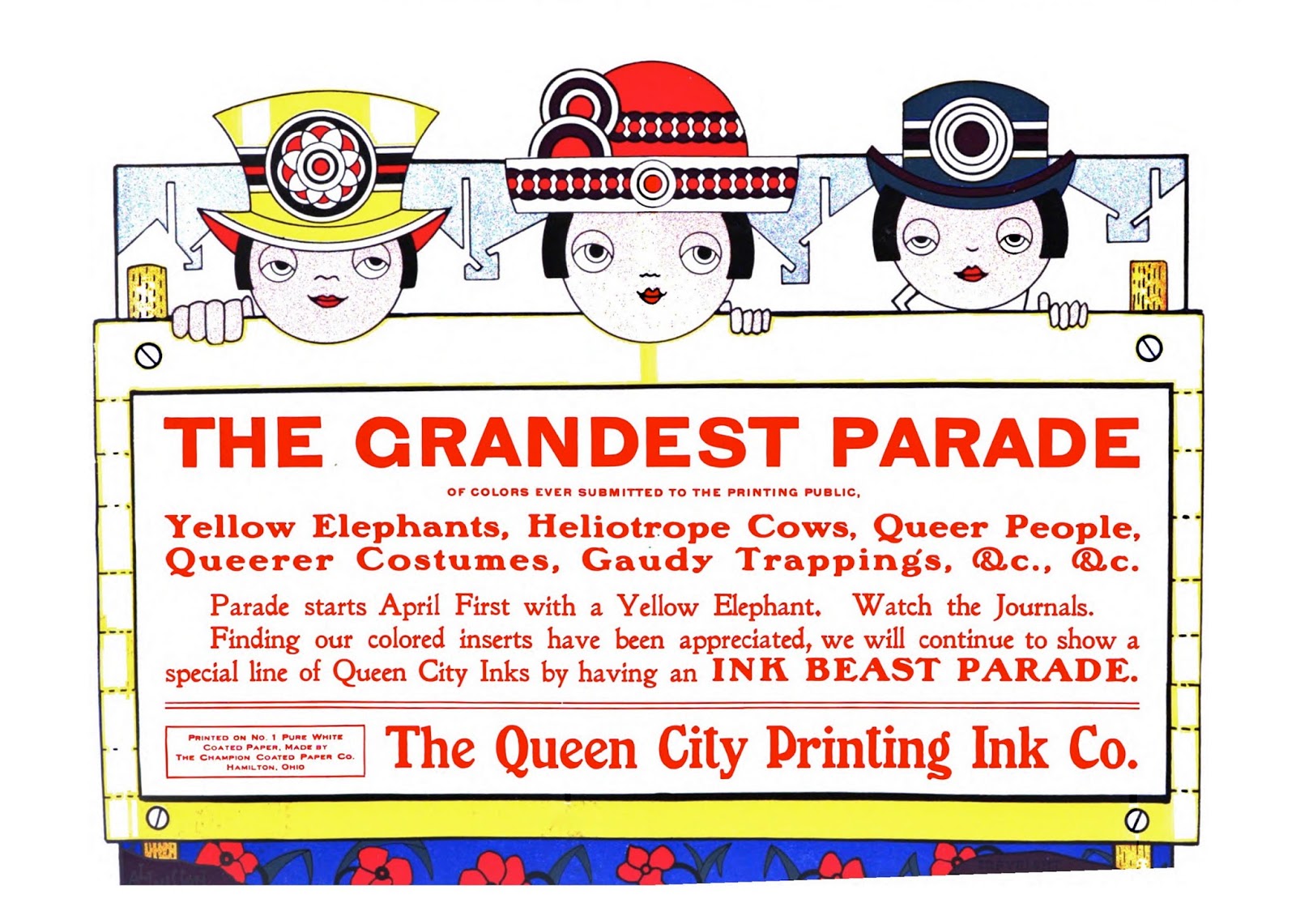
The Inland Printer, March 1904
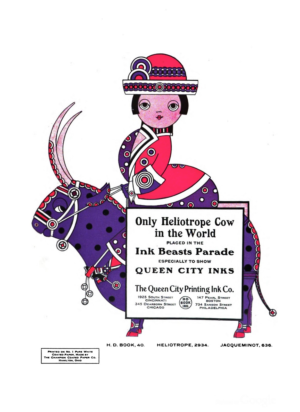
The Inland Printer, 1904 (advertisement was found here)

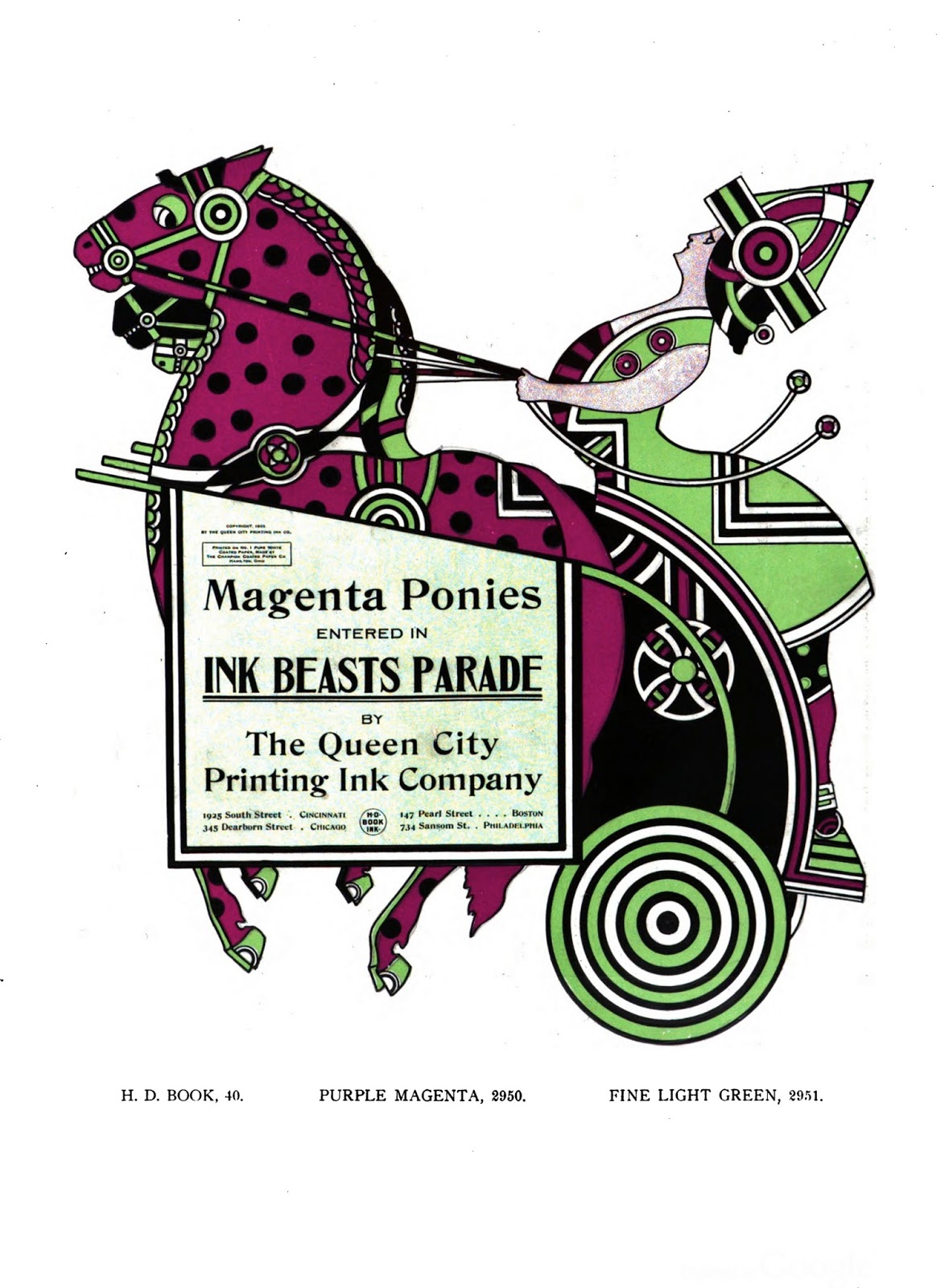
The Inland Printer, 1904 (advertisement was found here)

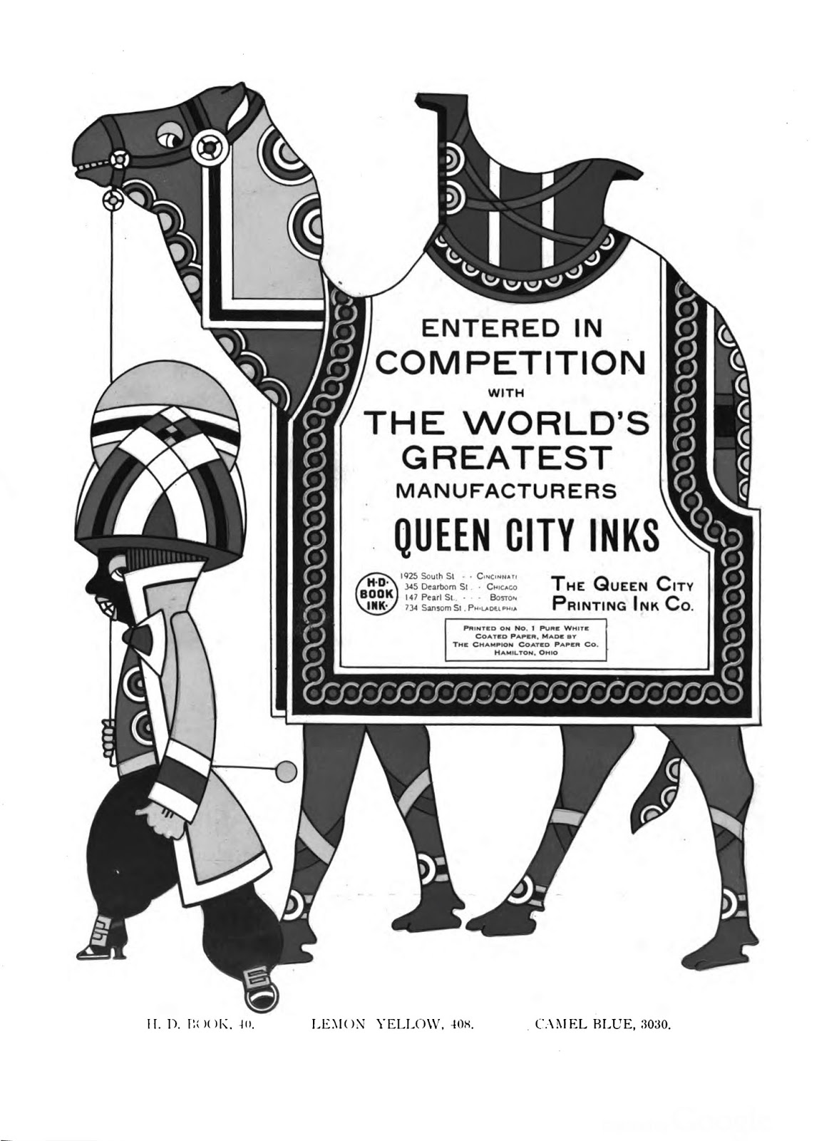
The Inland Printer, October 1904 (complete image is here)

The Inland Printer, November 1904 (postcard version is here)

The Inland Printer, December 1904 (postcard version is here)
The Inland Printer, March 1905

The Inland Printer, April 1905 (postcard version at eBay)
The Inland Printer, May 1905
The Inland Printer, June 1905
The Inland Printer, July 1905
The Inland Printer, August 1905

The Inland Printer, September 1905 (see December 1904 for postcard link)
The Inland Printer, November 1905 (see December 1904 for postcard link)
The Inland Printer, December 1905 (postcard version is here)

The Inland Printer and The American Printer/The International Printer,
January 1906 (postcard version is here)
The Inland Printer, February 1906 (postcard version is here) and
The American Printer/The International Printer, February 1906 and April 1907
The Inland Printer, March 1906
The American Printer/The International Printer, March 1906

The American Printer/The International Printer, April 1906

The American Printer/The International Printer, April 1906

The Inland Printer, May 1906
The American Printer/The International Printer, May 1906

The Inland Printer, June 1906
The American Printer/The International Printer, June 1906
The Inland Printer, July 1906

The American Printer/The International Printer, July 1906
The Inland Printer, August 1906
The American Printer/The International Printer, August 1906
The Inland Printer, September 1906
The Inland Printer, November 1906

The Inland Printer, February 1907
(second version is here; postcard version is here)

(second version is here; postcard version is here)
The American Printer/The International Printer, March 1907

The Inland Printer, April 1907 (see February 1906)
The American Printer/The International Printer, April 1907
(see October 1903)
The American Printer/The International Printer, May 1907


